Simplicity
“Simple can be harder than complex: You have to work hard to get your thinking clean to make it simple.”
Steve Jobs
It's obvious that you want to know as much information about your potential client as possible at the very first contact effort, due to time-saving purposes. If you keep this in mind, this is easy to create a huge, complicated and illegible contact us form. But remember – your users won't spend their precious time on it.
In general, on the first stage you need only an email and the name of a user, so be modest. Ask only the main, vital details. You can find out the additional information a bit later.
It would be the easiest way to copy something from your successful competitors, including their contact form, but better don't – you will copy their mistakes too. The best way to create a user-friendly contact form is to put yourself in your client's shoes.
We've been there and done that so here are a few recommendations:
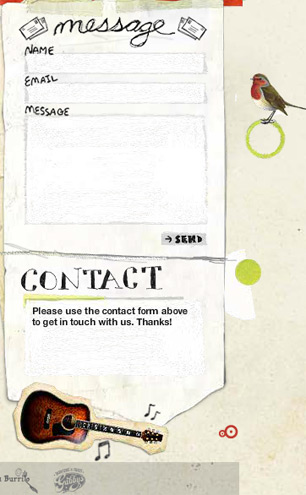
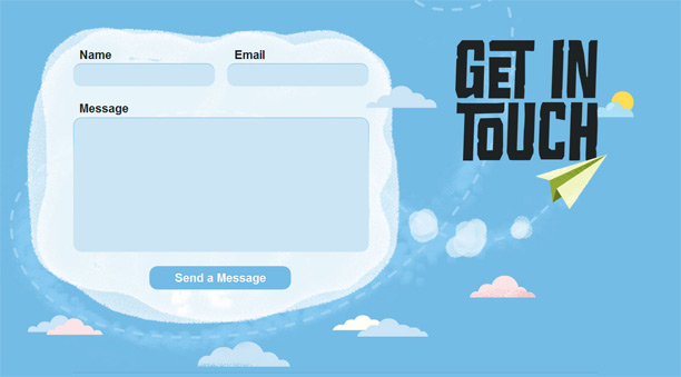
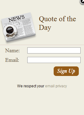
- Reduce the number of fields. You will probably agree that the first and main information in the contact form should be a user's name. There is no need to add two fields for the first and the last name – one field would be enough. It is obvious that email and the field for comments are mandatory too, because users need some space where to put their question, feedback, order, etc. and you need their names and emails to reply. Optional fields should be ruthlessly removed.
![]() An example of a proper contact form
An example of a proper contact form![]() A contact form with a number of unnecessary fields
A contact form with a number of unnecessary fields - Focus on structure. Users don't have to be mixed up with the structure of your contact form. Don't make them think. Stick to familiar for fields' location in your form. Place them in the traditional order: name, e-mail and comments.
![]() Name, Email, Message – the structure of a contact us form
Name, Email, Message – the structure of a contact us form - Add a call to action. Frequently, there is a need to push users to that final step and get in touch with your company. Give them that push! Place encouraging text on the visible place of your contact form page. Here are some examples of “call to action” texts:
- Contact us now.
- Let's get started.
- Send a message.
- Send it.
![]() Visible button with a call to action.
Visible button with a call to action. - Do everything you can to avoid friction. Highlight the respective fields for information input, add in-line validation and put some help texts next to the fields. In general, do everything to explain a user what the exact information he needs to input. In case a user makes a mistake in any field, provide immediate and easy-to-understand explanations of how to correct the mistake.
![]() A tip for a user in case of incorrect field input
A tip for a user in case of incorrect field input - Highlight mandatory fields: don't frustrate your user and be sure to highlight the fields he must fill. In most occasions, such fields are marked with the * sign or a special “Required” notice.
![]() All mandatory fields are shown to a user
All mandatory fields are shown to a user
 An example of a proper contact form
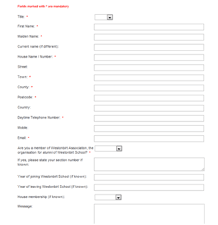 A contact form with a number of unnecessary fields
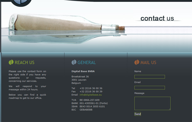 Name, Email, Message – the structure of a contact us form
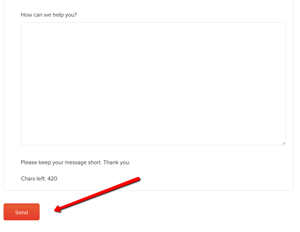 Visible button with a call to action.
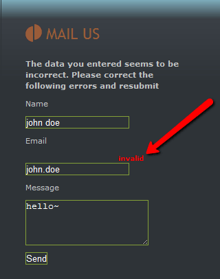 A tip for a user in case of incorrect field input
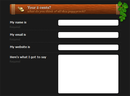 All mandatory fields are shown to a user
Are You Trying to Go Extra Mile?
“Fix your eyes on perfection and you make almost everything speed towards it.”
William Ellery Channing
There are some more advanced, smart and interesting approaches to make your contact form absolutely brilliant and to increase conversions on your website.
- Grab attention. Focus on the goal to impress your clients. They have to enjoy filling the contact form. So, add something memorable and catchy to this page, it has to be haunting.
![]() Clear, simple and memorable contact form
Clear, simple and memorable contact form - CAPTCHA readability. We do not recommend using CAPTCHA at your website at all. It is a measure that would be an exception rather than a rule. Use this method of spam blocking only in case your support team does not cope with all the mass of spammy messages, or if IP masks, anti-spam algorithms have serious breaches. But if you decided to implement CAPTCHA, pay attention to its readability. Don't make users just go away because of its quality. Here is an example of a user-friendly CAPTCHA:
![]()
- Make users feel secured. Ensure your clients that their information will be safe and secured. Add this notice on “contact us” page and create additional Privacy Policy page with detailed information on how you collect, store and protect users' data. Certainly, the link to this page should be on the contact us form.
![]() Assure your clients that information provided won't be used by any third party
Assure your clients that information provided won't be used by any third party - Set expectations. After submitting the information a user has to understand that it was delivered to the addressee and the request will be processed shortly. Make the user believe that the form works and he is heard, thank him for the made efforts and most probably such understanding will make him your potential client.
![]() These simple words will make clear for a user that his message has been sent and he can look forward to a quick answer
These simple words will make clear for a user that his message has been sent and he can look forward to a quick answer - Give alternative contact details. This is life, so be prepared for unexpected things. In the case your contact form is not working for some reasons, a user will have to find some other ways to get in touch with you immediately.
![]() Different ways of getting in touch with a company
Different ways of getting in touch with a company
 Clear, simple and memorable contact form
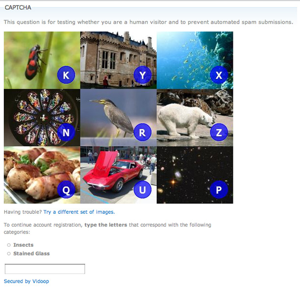
 Assure your clients that information provided won't be used by any third party
 These simple words will make clear for a user that his message has been sent and he can look forward to a quick answer
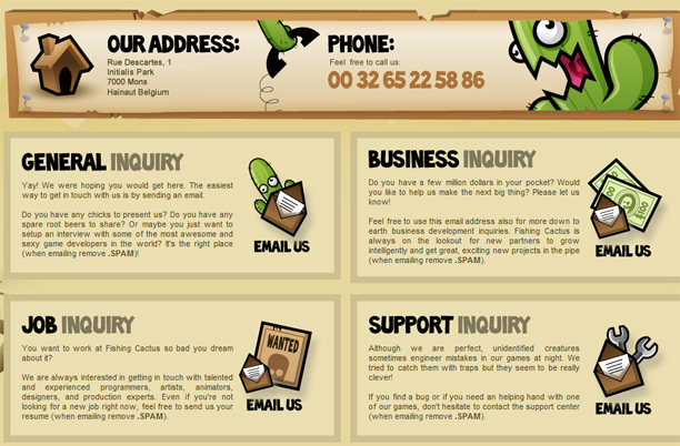 Different ways of getting in touch with a company
How to Make Sure, that Your Form Really Works?
“A pinch of probability is worth a pound of perhaps.”
James Thurber
Your contact form is ready and you want to see how the implemented changes influence your conversion rate. The best way to reach this goal is to make A/B testing. What is it? It is exactly what it sounds: you have two versions of a contact form (A – the old design and B – the new one) and a metric that defines the success. To determine which version is better, you subject both versions to experimentation simultaneously. In the end, you measure which version was more successful and select that version for the permanent use.
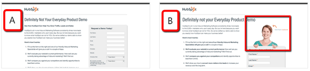 In this particular example Version A increased conversions by 24% by removing the female image
Every A/B test is individually designed to reach the certain goal. Here are some elements to test:
- Form's length and types of fields,
- The call to action's (i.e. the button's) wording, size, color and placement,
- Layout and style of a page,
- Images used on a page,
- Amount of text on the page (short vs. long).
We've made some researches and here are a few proven facts to make you think:
- changing one picture into another can double your conversion rate,
- changing color of a button can increase conversions by more than 30%,
- changing call to action text can increase conversion rate by 173%.
So, you should always test the changes. You can learn much interesting from the results.
What about Zfort Group?
“Don't live down to expectations. Go out there and do something remarkable.”
Wendy Wasserstein
As an international company that has clients from all over the world, Zfort Group is aimed to make our communication with them simple, effective and enjoyable. We want to be open and reachable for our clients wherever and whenever they are – twelve month a year, twenty four hours a day.
One of the most effective and convenient ways to get in touch with us is the contact form on our website. We want to highlight that every single message from our clients is important for us. Because this is an excellent opportunity to:
- know more about projects that might become our future work,
- find potential partners,
- know more about similar companies to share experience,
- get an important feedback or a bug report,
- get suggestions, comments and questions from our clients.
So, it was very important for us to create an effective and easy-to-use contact form.
We designed and tested, implemented fields and tested again. As a result, we've created a form that satisfies both ours and our clients' needs:
We have minimized the number of fields, leaving the most of them mandatory. In case a user decides to leave a phone number in the optional field, we know that this is a sign for us to better call him back.
If a user makes a mistake in the particular field, the form suggests the correspondent explanation:
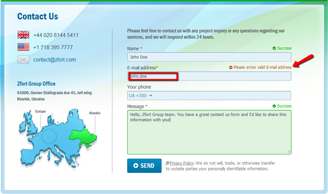
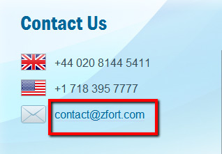
Also, pay attention to the alternative e-mail address to the left – if a user decides to use any e-mail client instead of the web form, he has a perfect chance to proceed with this:
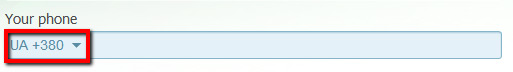
And as for the phone input field, we've put some development magic in it – the country code is identified by a user IP address. Our clients are from every corner of the world and we faced problems of identifying the provided phone numbers when a user forgot to mention the country code – we had to make an additional research that required some time and efforts. At the same time, this is more convenient for the user to see that some portion of work has been already made instead of him. Overall, such functionality simplifies user's efforts in the numbers input and also helps us get valid and full information.
Certainly, we didn't forget about the call-to-action:
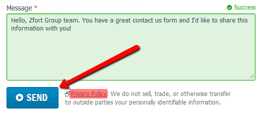
The link to Privacy Policy is also provided below the form. This adds a user an extra portion of confidence that his data is safe and secured.
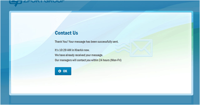
After sending a message, the user will see a window with a text explaining that the letter reached us and we make a response within the shortest terms. This is very important in terms of setting clients' expectations.
Remember that the contact form is an interface between your company and the whole world. So make a few efforts to make it easy and memorable. It will not take long to see the results!