economy and refugees by hiring Ukrainian Software Developers - we donate a lot to charities and volunteer foundations
People buy under the influence of emotions. It is people who decide to make a purchase, that people click on the "order it now", enter payment information in the field of the order form, etc. And all these people buy according to their own views.
Michael Fortin, one of the well-known experts on conversion improvement.
Introduction:
Presenting business products and services online is not the only function of a website. There are a lot of websites on the Internet, but a few of them are brining real profit to their owners. Resource on the web is considered to be successful only if it has a good conversion rate. Conversion rate of a website – is a ratio of a number of visitors who have completed some expected action to a total number of visitors. Often, the most expected action – is to buy a product or to order a service on a website. A good conversion rate is an indicator of usefulness of a website and business growth. So, how to increase conversion?
Design Strategy:
Design is a system of visual presentation and organization of information. Design determines appearance of a website, its memorability and identity. If you have no competitors, you can use the most primitive typical design. But if you are promoting a huge project in a tough competitive situation, design should be given a serious consideration.
- Website Colors
Colors play an important psychological role in influencing perception of existing and potential customers. The choice of background color and font has to be very wise: test it first. Then try to give a website the most user friendly look you can with the help of the chosen color. Don't forget to maintain its uniqueness. - Text
Text should be written for people. It has to be effective from the communication point of view – it should be easy to read and remember. Text on a website should be designed to attract visitors' attention to a given company and its offers. Keep in mind that all the texts on the websites of commercial organizations are “selling” ones.
The texts on a website should:
- Reflect the main theme of the site and organization;
- Contain information about the organization, its development, achievements and news;
- Formulate a marketing proposal in an accessible form;
- Inform about products and services, special offers, pricing, and promotions;
- Meet the requirements of uniqueness (no less than 85%), and SEO-copywriting.
- Buttons or Text Links?
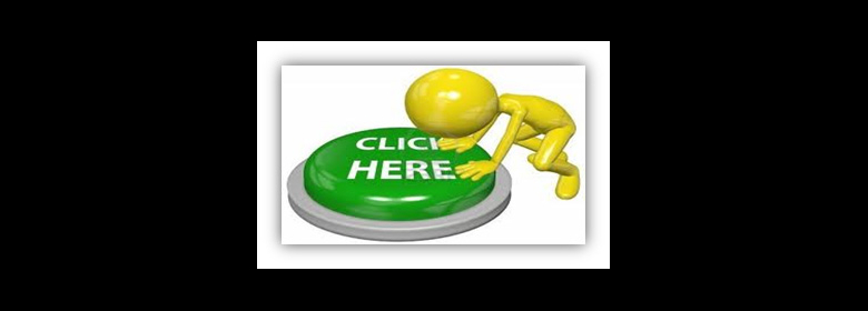
The fact is buttons are more clickable than links. They are simply more noticeable. If you are still using links for call to action ("Buy", "Checkout", "Register", etc.) on your website, try to use buttons. There are a lot of published results of experiments and a / b testing, which show an increase in CTR (click-through rate) 20-200% after replacing links with buttons. - Where to Place Buttons?
It is best to place buttons on top (visible part) of the screen than at the bottom. The Chitica company specialists in one of their studies compared CTR of advertisement units at the top and the bottom of the screen and came to the conclusion that the clickability of upper buttons is 30% higher than of the lower ones. This effect is not limited by advertising only but it is also applicable to any other actions connected with clicks. - What Is the Right Size & Color for Buttons?
Buttons should be visible but unobtrusive. A good example - the main page of crazyegg.com (company provides heat map services). Button color contrasts with the background and other page elements, it is big but not huge, there is a call to action text on the button and arrows pointing at it.
 - Using Images

When placing images on a website follow the next rules:
 Button color contrasts with the background and other page elements, it is big but not huge, there is a call to action text on the button and arrows pointing at it.
- Good results are observed for high-quality images with high resolution (the use of clip art or a low-grade photo has the opposite effect);
- It is desirable to use multiple product images for good conversion. One of them should be large (user can enlarge it if necessary), and the other may be of smaller format, but it must be clickable;
- Very good results are obtained by using 3D-images;
- Tapes with pictures increase conversion as well.
- Infographics help businesses engage their audiences with visual storytelling.
- Tell People What to Do
A user should clearly see how they can make a target action. If hundreds of target users visit a website daily, but they are not able to easily find how to make a purchase or request a price list, all promotional manipulations toward this site become meaningless. User clearly sees what they have to do on this page.Don't forget that a visitor can come to a website, not only from the main page, but from the page describing product page reviews, contacts, or any other. In this regard, construction of the path to conversion becomes a bit more complicated.
Thus, any page of a website should be able to become a starting and a transitional page, and at the same time directing the users to their destination point. - Single Column Layout
A lot of investigations have shown that a single column layout is much better for conversion than other options. This is just about simplicity for users: their attention is focused and not distracted by other details. - Look out for the “little foxes”
Here are a few recommendations that could help you improve the overall professional appearance of your website:
 User clearly sees what they have to do on this page.Don't forget that a visitor can come to a website, not only from the main page, but from the page describing product page reviews, contacts, or any other. In this regard, construction of the path to conversion becomes a bit more complicated.
- Don't use a visible website stats counter. Except you want to show off the popularity of the site, you should keep this kind of stats private. A number at the bottom of the website looks not very modern.
- Make sure that the website prints well. There are many web surfers who prefer reading a long text on a printed page rather than on the computer screen. A ‘printable' version of the website should be available for such users.
- Make the website ‘scannable'. The majority of web surfers will do a quick scan of your website before they are convinced that it is worth reading. This means that you should emphasize (through the use of bold, colored, underlined text, and appropriate headings) the high points of the website.
- Avoid using large header graphics that take away from the topfold of the website. The ‘topfold' of Home page is what the visitor sees before they scroll down the page. The more space takes up header graphics with a company logo, the less is left for the text that carries the major weight of the message that is being delivered.
- Loading Time
Internet users tend to be very impatient. If loading of a website takes more than 5 seconds, one can be sure that most of the visitors will not sit around and wait but go surf elsewhere. In addition, loading speed is also important as part of SEO. Google put sites which are loading faster on top of search results. - Audio/Video Explanations
People on the web are becoming lazier and lazier to read, so tell or show them what you want to say in the audio and video format. Moreover, it is desirable not to replace the whole text, but supplement it with multimedia material.
Plus, video is incredibly useful when you need to show something in action (work of your product) or to avoid explaining things in simple terms, but to show how it looks in reality.
- Users' Expectations
One of the most prominent reasons to leave your site is disparity between user's expectations and the content. Bright and attractive headline promise on the banner can entice visitors to your website, but your main goal remains the same – to sell! You do not need this empty improving attendance. In order to sell you have to satisfy users with content that they will find on your website. - Simplifying Registration Form
Try to remove unnecessary elements from your registration form. This can be such questions as user's age, gender etc. Also, you can do without CAPTCHA (which reduces conversion by 10%) for users who come around for the first time from a particular IP. Put call to action button on the visible part of the screen; make this button a haunting and outstanding one.
- About Us page
It is the page where you can place a quick resume-type synopsis of your company or yourself. Keep a customer in mind though. If you represent a selling company, there is no use to state that company's detailed biography on such a page. - Auto Validation
Twitter registration form is a great example of using auto validation in completing the forms. Registration begins on front page with an entry of a name, address and password. When you click "Sign Up", you will be transferred to the next page of registration, where you will see additional fields with tips (for example, field to select a user name) and confirmation of correctness of filling the main fields. Here Twitter uses a simple algorithm that provides a user with available login options. For example, if you have a popular name, then it may be difficult to pick up a free login name. But Twitter helps you by advising specific logins, which are still available - and this option greatly speeds registration.
 - Social Accounts Sign In
Users hate filling out long registration forms, so they may find it much more convenient to sign in with pressing only one Facebook button.
- Social Buttons Location
Pay attention to the place of social accounts buttons; they should be visible for users yet not annoying.
- SEO Texts
Is there a call to action text on your landing page? If not, then you should definitely add it. Prompt visitors what they should do on your website on a subconscious level. SEO-text contributes to more effective promotion of websites in search engines. In order to find necessary information, majority of users is using one of the popular search engines. This is why it is essential to involve relevant texts. - Remember to List Contacts
Contact details must include:Also, you can add the "live chat" to communicate with users.


 Here Twitter uses a simple algorithm that provides a user with available login options. For example, if you have a popular name, then it may be difficult to pick up a free login name. But Twitter helps you by advising specific logins, which are still available - and this option greatly speeds registration.

- Full name of the company;
- Contact address (physical location);
- E-mail;
- Phone number;
- Free hotline.
- Be Relevant
Put on the landing page which your users would be searching for. If a user does not find their objective, they will leave your website immediately. - Be Clear, Open and Honest
If you have some product out of stock – inform your visitors about it. This can annoy the users quite a bit, should they read all about a product they were interested in, add it to a cart, and start the checkout process - only to find out that this product was actually not available. - Take the Risk Away
Use SSL to secure the page on which the user enters personal and payment information. Get SSL-certificate to secure pages that involve typing important information. Make sure that the icon for SSL is visible in different browsers, and protocol is working correctly. - Return Policy
Give the money back guarantee. It is proved that users are not asking to return the money very often, while the statement that you can do it greatly increases your credibility. Describe the most important aspects of the return and delivery policies. - Privacy Statement
Include a ‘Privacy Statement'. Users are becoming more and more sensitive to how their personal information is being used. This makes it almost imperative for you to provide a page with your privacy policy.
- How you use the information that is collected.
- Is the information shared with a third party?
- How they can opt out of any mailing list they sign up for.
- Why you track their IP address.
- Reviews, Feedback
Create a page with customer reviews: your visitors should know that those who have already bought your product or service are absolutely satisfied. - Provide ‘Live Support'
It can make a significant difference if you are there when the customer needs you most – during the buying decision.  When Will I Get It?
Create a page that will describe the terms and conditions of service. Be sure to include a full cost of purchase before a buyer confirms their order. An indicated price should include taxes and shipping costs. Make sure that a buyer does not have to pay more because of hidden extras. You must be sure that the schemes of order, payment and delivery are absolutely transparent.- Payment Options
Describe all the payment and delivery methods on the home page. Do you accept PayPal, Visa, MasterCard? If yes, put logos of these services in the sidebar.
- Do a Special
Make an offer that users cannot refuse. Offer something valuable to visitors free of charge. For example, if you sell bike for triathlon, you can offer your users e-book free download from your site with tips on how to ride a bike, how to choose the speed, maintain a bike and so on.
- Am I Getting the Best Deal?
You need to highlight all the benefits you can provide for you customers. Place info such as:No need to make these benefits come as a surprise at the end of checkout process. Tell the users about that on the main page.
Conclusion:
And at the bottom of the list: "Test before invest" – an old proverb of marketers. The rule is to always test any changes to see how they will affect conversion. Test everything:
After testing, you can come up with new ideas to create additional elements of a website or on simplifying existing ones.
Do not ignore comments of real users – they can point out things which you would not have noticed on your own.
Never stop in the process of improving your website, monitoring statistics and making necessary changes and you will gain success – have no doubt!
 When Will I Get It?

- Free shipping
- Best service
- Special conditions, etc.
- Title
- Captions to images
- Your offers
- Calls to action
- Prices
- Bonuses
- Menu locations
- Number of items
- Size & color of the buttons, etc.